Gross Load Status Analysis
Description
This report displays a graphical view with a tabular data grid showing either the quantity of work orders, labour hours, labour cost, material cost or downtime, based upon user selection.
Each chart element is broken down into work order status. The report offers much flexibility in configuring the analysis type and analysis time units.
The report returns;
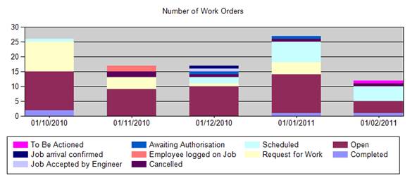
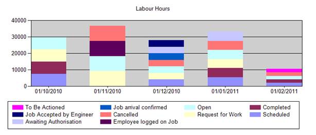
Bar Chart
Dependant on selected analysis types;
X-Axis
Time scale, the intervals are based upon the selected options at run time.
Y-Axis
Either;
Count of work orders
Sum of labour hours
Sum of labour costs
Sum of material costs
Sum of down time
Each bar on the graph is then colour coded according to work order status. There is a legend under the graph that shows a colour map.
Data Grid
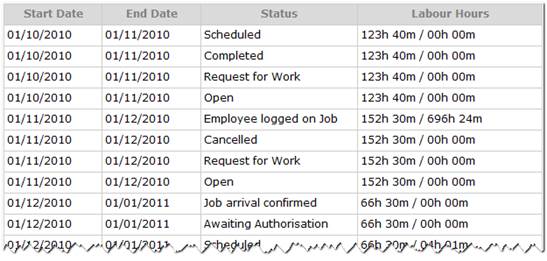
Start Date (Start date of analysis period)
End Date (end date of analysis period)
Status (Work order status)
Labour Hours (Calculated)
Operational Criteria
The report will return all work order records matching the required filter criteria. The calculations are then based upon the selected analysis type values.
Filters
• Equipment range filter
• Start and end date range
o This date is determined by the selection made in the work date selection list.
§ If start date is selected then this will include any work orders that have been raised against the equipment item where the work orders start date is within the specified date range
§ If due date is selected then this will include any work orders that have been raised against the equipment item where the work orders due date is within the specified date range
• Job Type
• Priority
Control values
• Analysis unit
o This controls the x-axis scale and the basis for calculating totals. The available options are day, week, month or year. The scale intervals are set accordingly for the period between the selected start and end date.
• Analysis type
o This controls the y-axis scale and what will be calculated. The available options are;
§ Work orders (this is a count all others are sum values)
§ Labour Hours
§ Labour Costs
§ Material Costs
§ Down Time
• Work Date
o This determines the basis for which work orders are selected; please refer to the Start and End date range.
• Number of items in one chart
o This allows the user to restrict the number of columns in one chart so that the chart does not become unreadable if using a large date range.
The way it works;
The report takes the period between the start and end date and then divides this into intervals based upon the selected analysis unit.
For each interval it the gets all work orders that fit the filter criteria, these are then grouped into work order status and the appropriate calculations made for each status and then overall. This is then displayed in the chart and the table.
The table shows the totals for each work order status within an interval
For example;
If we set the control values to Analysis Unit = ‘Month’, Analysis Type = ‘Work Orders’, Work Date = ‘Start Date’ and 30 items in one chart. And set a date range filter 02/02/2010 to 02/02/2011 then;
The report would split into monthly intervals with the first interval being 01/02/2010 to 01/03/2010, all work orders where the start date was in this first interval date range would be grouped by work order status, and then the work orders in each status would be counted.
Then the overall number of work orders in this interval would be counted.

This date is then used to generate the graph, the proportion of each work order status being represented by a different colour. The same process is then repeated for each interval in the selected range.
Aims
The report aims to provide analysis of workload for a given period, by volume of and associated costing of work orders.