Metrics
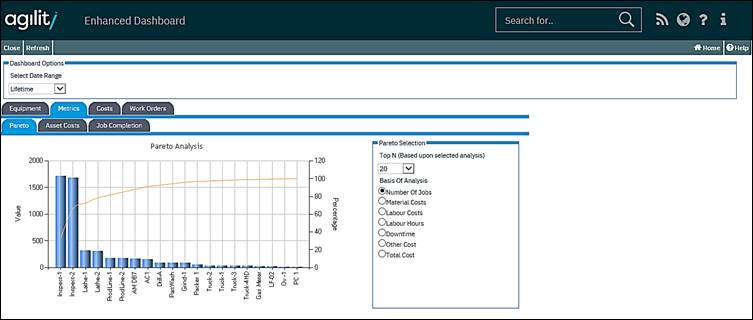
On the Chart above, there is a screen-tip being displayed. This appears when you point to the “green line” (and in this example, I’ve pointed at the line about halfway across the item “Inspect-2”).
This line represents the “Pareto Distribution” and is effectively telling us that the first two equipment items are generating a massive proportion of the jobs.
On the right-hand side of the Chart, there is a Combo Box labelled “Top N (Based upon selected analysis). This allows you to restrict the number of Assets being displayed on the Chart, the values range from 5 to 50.
Underneath the Combo Box there is a series of seven Radio Buttons which allow you to change the focus of the Chart.
These options are:
• Number of Jobs
• Material Costs
• Labour Costs
• Labour Hours
• Downtime
• Other Cost
• Total Cost
More:
 Metrics - Asset Costs Tab